Corporate Culture
Nexen is a company creating future values
- Corporate principle
- Vision & Core Values
- CI
The three major principles pursued by Nexen are
1. Teamwork : build today and open the way to tomorrow with emphasis on team-spirit
2. Future oriented mind : challenge the unknown with future oriented mind
3. Technical innovation : work for customer satisfaction by drawing on all of our capabilities to offer superior products and technologies
01
Team work
02
Future oriented mind
03
Technical innovation
Global Leading Company, NEXEN
InnoVation
Integrity
People
VIP² TO C
Passion
TeamwOrk
Customer
InnoVation
- The essential ingredient for growth and survival
- The absolute means to achieve the company's vision
- Aiming to become a company in full of innovative spirit
Integrity
- The basic grounding in straightforward and transparent management with faithfulness
People
- Our best asset for success is our employees
- Strengthening our policy toward human resources is to nurture our employees into acquiring professional capabilities with global mindset
Passion
- The cardinal virtures to core competency is passion
- Passion is the professionalism that can help people overcome difficulities
- Passion is contageous
TeamwOrk
- To build up a cooperative relationship reaching to a concensus upon what has been agreed
- To solidify internal communication channels vertically and horizontally based on mutual respect and trust
Customer
- To be proactive in building up a client base and seeking solutions to client's needs
- To palce maximum values for customers as much as shareholders
- To maintain customer oriented mind to give customers more than satisfaction
- To become fully innovative by learning from and seeking the needs of customers
The philosophy for our products is
to cherish the nobility of lives
NEXEN's crimson stands for nobility.
NEXEN's symbol is symmetrical to express balance and development.
It symbolizes the corporate's image pursuing fundamentals and spontaneous changes. The interconnected typographic design represents the company's assimilation with customers and employees and is easily associable with tires to express the identity of NEXEN.
This is NEXEN's principlesto to value the nobility of lives and the symbol of nobility created by the completion of products.
The crimson color is NEXEN's wills to apply strong passion to characterized products.
KOREAN LOGO TYPE

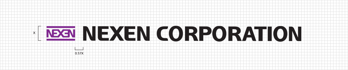
ENGLISH LOGO TYPE
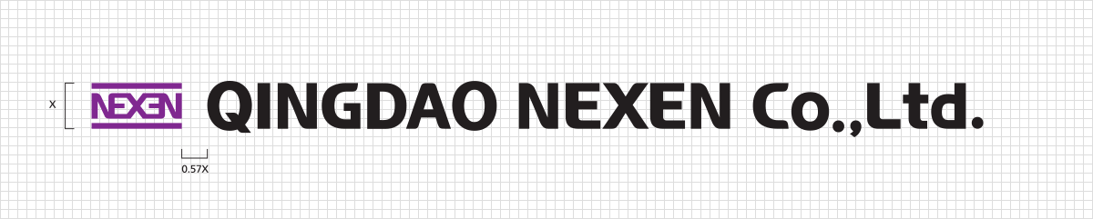
CHINESE LOGO TYPE
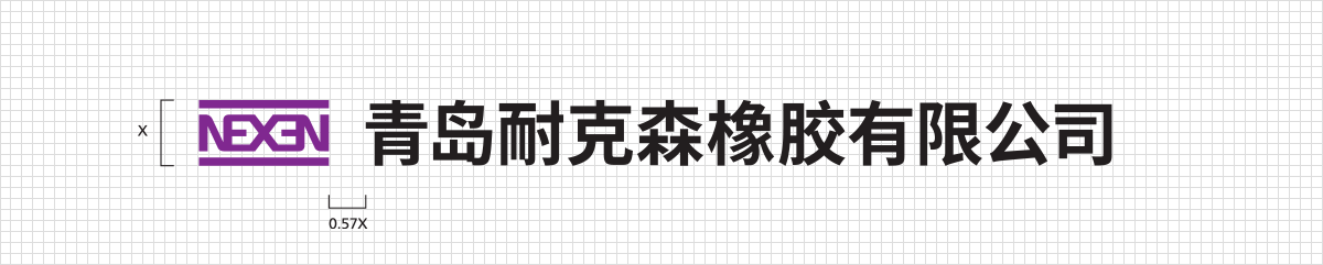
- The signature is the organized combination of symbol mark and logo type and the direct indication system of NEXEN's corporate image.
- The signature system comes in Korean, English, left-aligned, right aligned, top, bottom, and abbreviated versions as it is widely applied to various forms, signs, and promotional materials.
- Therefore, there is no additional standard to require combination of top and bottom or left-aligned and right-aligned versions.
- The proportions, width, and size of the signature cannot be modified randomly.
- For reproduction, the manual must be applied to reproduce the signature by copying or printing.
COLOR SYSTEM
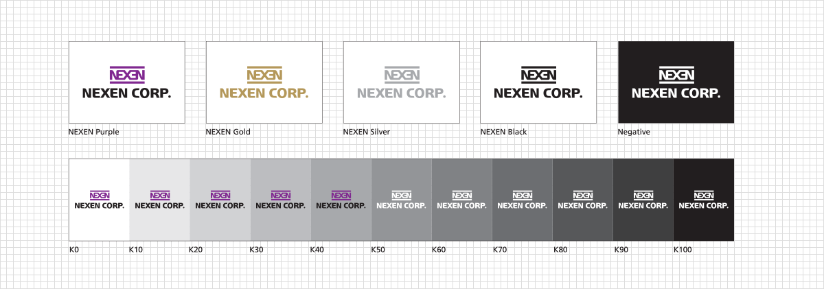
As the random modification of color and shape of the symbol mark alters its original image, standard colors and shapes must be used. The most basic symbol mark is in crimson color on a white background. However, black may also be used on a white background. For special effects, gold or silver may be acceptable. Please download the color scheme manual below to learn more about our color scheme.